Tuesday, August 14, 2012

Motion Graohic Opening Countdown

One Video Film Festival Opening Countdown 
A school project for Motion Graphic Design subject

Theme: One Video Film Festival & Lego
Music Credit: MEG - koinobakudan

HD version: https://vimeo.com/47445001


Monday, January 9, 2012

Beautiful Website with analysis

1

  • simple and clean, a lot of playful little things can grab attention
  • interesting navigation and scroll bar design 
  • lot of tiny moving animation, very interactive and fun 
  • nice hierarchy and color mood
  • nice use info-graphic


2

  • I am a fan of this drama "The Walking Dead" because this website XD
  • the layout is very unique and nice hierarchy
  • also a very interactive website, you will know what you are select
  • nice color mood and background
  • very friendly, easy to switch off the music and back to top
  • bad things is don't have language select, to make it become English. Because i don't understand the content, and the vertical scroll bar spoiled the design


3


  • this is a very cool website although it don't have any content or navigation, still can bring out the message very well
  • it is very creative method of using this website to bring out the idea
  • but i think it should put more information and content after the video
    (this website must be connect with Facebook)


4


  • this is a very unique and outstanding website also, when i first time to visit it, i thought it was a virus
  • very well use of the scripting (don't know it only use HTML or include Javascript, ASP, PSP )
  • very fun way to use of scripting 
  • very interactive 
  • but lack of hierarchy   


Competitors of Serendah Websites with Analysis

1

  • Malaysia local competitors website
  • boring and same layout, old design
  • no hierarchy, no interactive
  • is a normal template website


2

  • Malaysia local competitors website
  • main page is fresh and clean
  • click inside the page the whole webpage will float to left, scripting problem
  • lack of detail information and interactive
  • bad navigation because of no user friendly, need to mouse over the button only know what is the inside about
  • no hierarchy 


3

  • foreign competitors website
  • it is very modern and stylist
  • very unique cube navigation design, very attractive
  • nice interactive and the background will keep moving, make the website alive
  • nice hierarchy and typography
  • nice graphic and very consistent
  • if the content below can be arrange nicer will be better 


4

  • foreign competitors website
  • very unique and nice navigation, well use of the typography
  • good interactive 
  • and the layout is very neat and comfortable 
  • nice graphic, nice hierarchy (i like the "book now" button)
  • also if the content below can be arrange nicer will be better 


Thursday, December 22, 2011

Skylar Grey digital painting

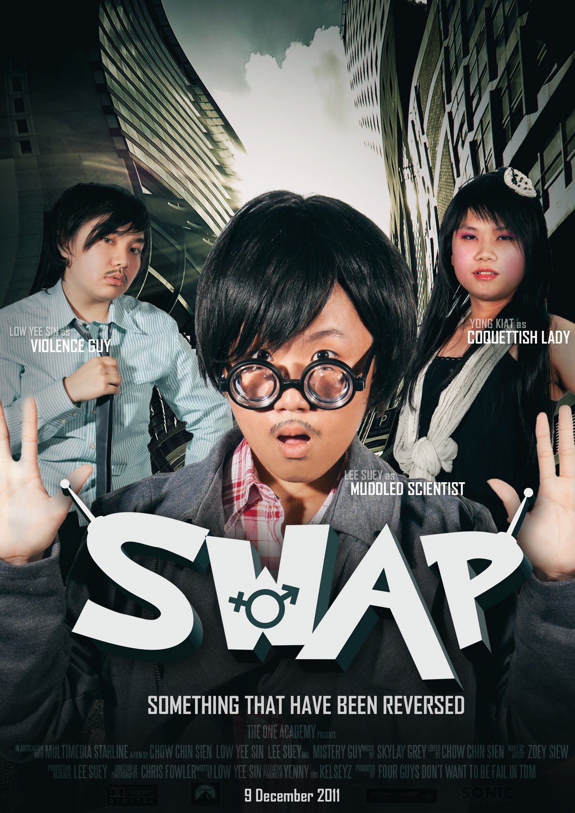
WOW~finally have done it...spend me a lot of time to draw it..
Skylar Grey is my favorite singer, she got an angle voice~
and this theme is about the current single of Skylar Grey, Invisible

Media: Digital Painting, photo montage(crow, rose)
Software: Photoshop, Illustration

Friday, December 16, 2011

Typography of Digital Media Assignment 2

Project 3 (Interface of New Media)
Title: Interactive Toilet Mirror
Purpose: Promote Silkygirl product


Digital Interface:


Prototype:


Typography of Digital Media Assignment 1

Project 1 (Typo Motion)
Title: Say NO to Violence against Children


Story Board:


Video:


Project 2 (Iphone interface design in 3hours )
Title: Celebrity Fitness